“You are here” indicators. We get this phrase from maps, according to Steve Krug, who was the keynote speaker last night at the Usability Professional Association (UPA) Boston meeting, held at Olin College of Engineering.
Chris Hass, chapter President and Usability Consultant at Bentley College presided over the meeting and quickly introduced Steve Krug, author of the best seller Don’t Make Me Think .
The two magical points;
- Effective “You are here” indicators
- Prominent Page Titles
That my friends is the core message. You can go home now, as long as you are not disappointed. If you are, then stick around for a little more detail. Steve anticipated the same disappointment, and we all stuck around.
You are Here
Ways to highlight the current location in the primary navigation are numerous. You can make the text
- Bolder
- Larger
- Change the color
- Reverse the background
- Indent
- Italicize
- Underline – and there are many more options to fit your needs
However, designers love “design subtleties”. This is what they are most proud of. And the users, well they miss them every time. Steve was clear that designers “have to be louder than you like to be, because the visitors move so fast.”
We need to help visitors navigate. “You are here” helps people navigate. Steve mentioned that visitors who give up on the navigation and instead click in the content area to find what they need are disappointed 99% of the time and leave the site. Much better odds with the navigation.
Tabs are a recommended interface for primary navigation and StumbleUpon was offered as a very good example. Pretty clear that we are on the home page in this image.

Notice that the tab is the same color as the page.
There is no line between the tab and the page content.
The Home tab is also the most visually prominent tab.
This makes a compelling case for making your “at state” tab the same color as your primary background.
It was also suggested to be sure to include a Home page button with the primary navigation. Kind of surprised me, but ok. It does make it clear that here is the navigation scheme and similar looking links are primary navigation. Relying on logo clicking to get Home is not good enough.
Including a Home button also draws the visitor’s eye to the navigation at the start.
Another suggestion, make the active tab a little taller than the rest, a little bigger or consider bolding the font.
Consistency does not trump Clarity. Consistency is not always best. Shocking but true. Be flexible and be clear.
Text Links
There is an implied social contract with text links. The visitor sees the link and figures where it will take them. If it does not, you have broken the contract.
Steve implored that, “the text link has to deliver what you promised, they have to be what they say they are.” Otherwise you violate the social contract with the user. The most likely outcome is their immediate departure.
Page Titles
Prominent, well placed page titles is the second point.
They should always be at the top of the content space.
The text of the primary navigation should closely match the page title.
Page titles should be bigger, bolder and prominently located, though they need not be biggest.
Useful Tips
Feel free to break the navigation into two sections simply by adding 10 pixels or so of space.
The type face of your navigation should resize along with the body text.
Contrast is more important than type size for legibility. Good to know.
Steve recommends using the three differen sized A’s icon for visitors to resize the type themselves. This will become more accepted and valued over time.
Bread crumb navigation should include the current page, but the current page should not be clickable.
For example, In the following navigation scheme,
Mens > Boots > Walking > Brown
if you are on the Brown page, Brown should not be clickable.
This is similar to the Home page link not being active when you are on the Home page.
The best pointer for “at state” navigation is the sideways triangle pointing at the text.
A couple of sites that do all of this quite well,
www.harlem.org – continue clicking on the photo for more information
www.scottmccloud.com – very clear where you are
In addition to great information, I met some wonderful folks and am encouraged to visit again after my first UPA meeting. An impressive group of people. Thanks all. Oh, and Steve has a certain fascination with boxfish. A yellow rectilinear form found under water.
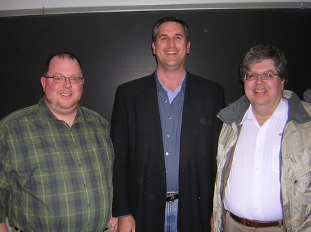
Chris Hass, Jim Spencer and Steve Krug at UPA Boston meeting
Three more photos here; http://www.flickr.com/photos/jbspartners/
Please click on the green button below to share this article.
Please leave a question or comment about this article and include a favorite usability tip.
Thanks for the excellent pointers on the subtlety of website usability.
Subtlety works for both print and web…just in different ways.
John thanks for stopping by and commenting. Yeah, we just have to be careful to not be too subtle and we have to keep the focus on clarity a little more than consistency in some cases. Steve made a lot of sense on these points.
This was my first meeting with the UPA Boston, and Jim did a fantastic job capturing all the great points that Steve made during his presentation. After reading this posting I felt like I was back at the presentation. Thank you Jim.
Steve Krug’s book has been sitting on my desk for over a month now, begging me to read it. Perhaps this is the push I need to actually devote the time.
These notes seem obvious, but I know the ideas it presents certainly aren’t being used regularly – I know I am guilty of skipping them every once in a while.
I like breadcrumbs for sites with 2 or more sub levels, but anything less seems overkill. I especially like the way Digg handles subnavs below main navs, instead of only displaying subnavs on rollover.
Great article! Dugg!
@Dave you are quite welcome. Thanks for stopping by.
@Chris Consistency is key in good design. Good points.