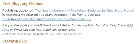
Hubspot, author of WebSite Grader, sponsored a webinar with Paul Gillin, author of The New Influences – A Marketers Guide to the New Social Media.
Here is a story of business engagement. Engaging the audience and developing a conversation.
I asked a simple question of the presenter, which was asked and answered by the speaker during the webinar. Nothing spectacular here yet.
Then the speaker offered to look over my blog and offer suggestions after the webinar. I took him up on it and he followed through. Mike Volpe, VP of Marketing over at HubSpot provided substantial suggestions. Many are on my to-do list.
Mike also referenced a few articles on the HubSpot blog so I spent a bit of time reading and found many useful articles. This exceeded my expectations of the benefit of joining the webinar, as did Mike’s email that included eight suggestions for my blog.
So, as a way of showing my appreciation, I would like to offer a few suggestions on how to improve the usability of the HubSpot blog. I willingly admit that I do not yet practice all of these suggestions here at www.jbspartners.com .
Let’s Start the Overhaul Recommendations for HubSpot’s blog
One of the important factors of good usability is predictability or accurately indicating what is ahead. This dictates a common-sense order of events. Order and relative position are themes you will find illustrated as you read on.
Click the thumbnail below to see a full size screen shot of the HubSpot blog page that is being reviewed. Opens a new page.
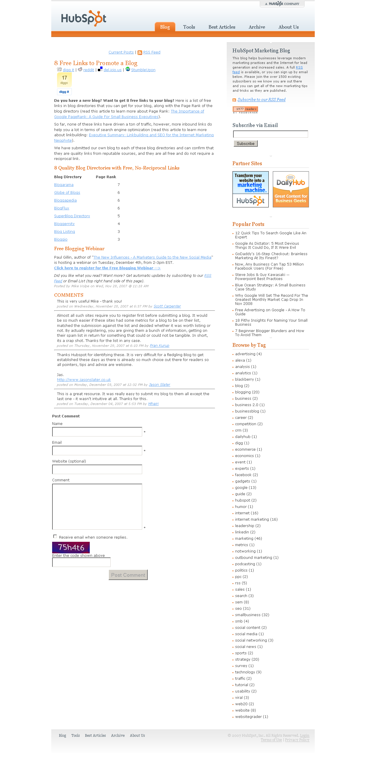
Promotion
Digg, StumbleUpon, del.icio.us and reddit are valuable tools to help spread the word about quality articles. Below is a snap shot of a HubSpot blog title with social bookmarking links.

How can this be improved?
Could the social media text links be shifted down and placed on the same row as the Digg flag, instead of on top of the Digg flag? Stacking them leaves a large amount of blank white space to the right of the Digg flag, which is often restful, but not needed here. The post title is quite lost because it is placed so close to these links and graphics.
And for the posts that have not been Dugg, still move the social bookmarking links away from the title.
In fact…
Could you move these links to the bottom of the article? I might feel more genuine about voting for you after I have read the article. Why make me scroll back up to the top of the page to click the link? Move the social media links to the bottom of the article.
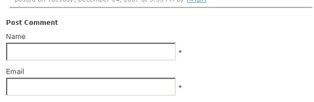
Byline
Who is the author? Introductions generally come before conversation. Place the byline at the top of the post instead of the bottom of the post. If the blog post is low on graphics, add an avatar or a photograph of the author as well. This kind of personalization is helpful when you meet the author in person or see the same photo elsewhere on the web, even in the comments below.
Date
When was the post written? Please don’t make me scroll down to the bottom to search for a date that is presented in tiny, faded font. Readers care. Information does expire. Don’t be afraid. Trust your readers. Include the date at the top . Many subjects on the Internet are date/time sensitive. Get this information out in front of the article.
Comments
Same as above. Honor your commenters by placing the comment author’s name and the date above the comment. Those that comment are often a part of a community. They will be looking to see if others that they know have commented. Books and newspapers place the author name before the text.
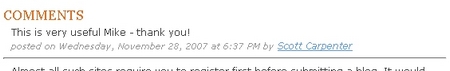
Place the commenters name first and date (and time information if needed) after the name.
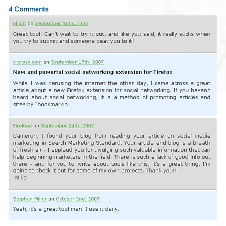
A long column of comment text is boring. Instead, modify your comment styling to alternate the background color of every comment. This adds a bit of visual interest, breaks up the column into readable chunks, and aids the reader that is scanning the page. We know that readers scan, this change will make that easier.
This is a sample of alternating comment colors taken from www.cameronolthuis.com
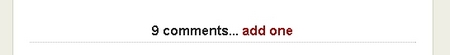
Displaying the number of comments at the start of the comments section further enhances usability by providing the user with information about what is ahead. Nine comments is very different from 256 comments.
This is a sample taken from www.copyblogger.com
The HubSpot blog authors are very proactive about commenting on the blog comments. :loud applause: This encourages the sense of community that results in more comments.
Readers are interested in what the author has to say and who the author is. They also want to see if the author is reading and responding to posts. Uniquely style the comments of the author. Choose another background color, add a one pixel boarder, or what ever works with your style.
![]()
This example is taken from www.pearsonified.com Chris is the author. Here he uses bright red next to his comment.
Day of the Week
Providing the day of the week, month, date, year and time of the post might be too much information. I vote to remove the “Wednesday” portion of the date. Do not eliminate the year.
Spacing
Evenly spacing everything gives equal importance to everything. This does not provide the visual queues to aid the reader and provide good usability. Add extra blank lines before new areas of the post. At the end of the article add a blank line. An orange colored “Comments” title is very helpful. Give it some room by adding a blank line above it.
After the comments section, add a blank line before the comment form.
Remember to place related things near each other. Even in this blog post that you are reading, the bolded title “Spacing” that begins this section is nearer to the text about spacing than the text above which is about the Day of the Week or even the text below which is about the Comment Form.
Comment Forms
The button says “Post Comment”. “Post” is a technical term. Let’s be more welcoming and friendly. Try; Leave a comment, Leave a reply, add a comment.
The captchka is regrettably necessary. The explanatory text could be placed next to the text box and the word “code” could be replaced with the word “text”. Nothing wrong with adding a please here either, since this requires an extra effort of the visitor.
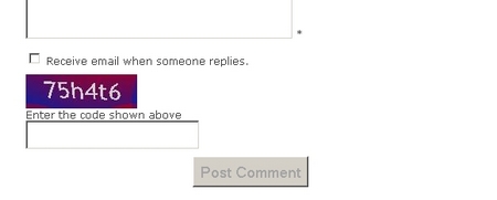
Required Fields
There are asterisks by the required fields. Many visitors are new to blogs as well as commenting. The form should make it as clear and easy as possible for them to participate. Add required field explanation text so that visitors can see what is expected of them before they see an error message and leave.
Email Notification
I always appreciate the ability to subscribe or to be emailed when there are comments made to a post that I have commented on. Great idea. This develops the feeling of engagement and starting a conversation. However, using the term “someone” is less supportive of this objective. What is being offered here is the ability to “Notify me of follow up comments via e-mail” So, we could just say that.
![]()
Quick Summary
- Social Book Marking tags belong at the bottom of a post
- Bylines belong at the top of a post, along with the date
- The comment author name and date of the comment should appear before the comment
- Alternate the styling of comments
- Provide unique styling of the blog author’s comments
- Display the number of comments at the top of the comments section
- Keep day/date/time information simple
- Space related content near each other
- Space unrelated things apart from each other
- Explain required fields
- Email notification is awesome
Two questions?
1) What did I miss?
2) Why would you do something different?
I look forward to reading your comments.
If you would like to learn more about styling your comments in WordPress specifically one place to read is here – http://www.pearsonified.com/2007/11/professional_stylish_comments_for_blogs.php
If you like this article, click on the little green “Share This” icon below. It will help you share the article in the manner of your choosing. There are two tabs and lots of Social Bookmarking choices for you as well as “email a friend”.
Glad you enjoy our blog! Thanks for sharing some ways to improve the design/layout. I’ll be sharing this with a couple other folks internally. Thanks!
That’s an excellent analysis and it explains a lot of design choices that have become almost standard practice.
I wrote a post examining some of the different approaches that sites take when dealing with comments from their users:
http://www.mmmeeja.com/blog/web_design/comment-designs.html
Hubspot doesn’t allow nested comments or simple HTML, features that can really add value for commenters. Another way of appreciating your commenters is to allow Gravatars so people can easily recognise comments from internet superstars.
@Mike Thanks for commenting. I look forward to your progress.
@Andy You have added some good points. I wonder if a commenter that does not have an avatar feels like they are not invited to the party. If you have a tech audience that is not a concern. Which avatar program do you favor?
Loved the post, especially the use of screen shots, I always forget about that. I would like to have seen more analysis of social interaction design elements. How the blog was designed for encouraging more interaction between readers, and the bloggers. For example, I recommend every blog have an email subscription for each comment post. (Note: I don’t have this on my PR Communications blog, as typepad does not offer this yet. One reason why WordPress or Movable Type are my recommended blog publishing systems)
@John A picture can be worth a thousand words. Thanks for your comments.
Excellent site, keep up the good work
Just one question though. Have you made writing this blog as your profession or do you do this in your spare time?
This blog represents the work that I do for a living. It is a marketing tool. Writing here is definitely spare time wise.